Business Cards
Leave Behinds
- Michael J. Samaripa
- http://www.michaeljsamaripa.com
- I like how simple his website is, its very easy to navigate, and he has a lot of photos to look at
- No issues with his website, to me it was perfect and simple
- 8 Drop downs
- 55 photos
2. Chris Fredericks
- http://www.atxdrazah.com
- I like the simple layout, the back ground is white so nothing is distracting, & I like his about me section on the bottom
- When you click one of the pages there is no home button to go back to the home page, portrait is the only page with photos, & I don't like the photo layout on the portrait page
- 4 drop downs
- 23 photos
3. Chad Everett
- http://www.16daysphotography.com
- I like that he offers prints, lessons, & There is a variety of work
- The website has to much going on in my opinion, the slide show moves on its own, & the other slide shows are double click
- 4 drop downs
- 36 photos
4. Korey Howell
- http://koreyhowellphotography.com
- I like the layout of her portfolio, she makes the prices very clear and what she offers
- Her website is somewhat hard to navigate, It looks like she has ads on her website,
- 7 Drop downs
- 60+ photos
5. Shelby Gould
- http://www.shelbyanngould.com
- I like that fact that the "album" of the photos is on her portfolio and when you click the photo it shows the rest of the shoot. By having the albums that way, it shows what she does in an easier and cleaner looking way. She also lists who she's collaborated with, which I really like.
- I wish she included more photos in the album just so I could see more of her amazing work, but professionally I like the simplicity of it. When you hover over the photo over the album name, you sometimes can't see it with certain cover photos because of the photo, I wish she would change the color so I can see the name.
- 4 Drop downs
- 48 Albums
6. J Antonio
- http://www.jantonioimages.com
- I like that the homepage is black instead of white (i usually see photographers use white) it really compliments the photos in the slide show. He shows his prices & services in one of the drop downs, which is really nice.
- On the home page i wish the slide show was in the middle and every thing should be aligned. It looks slightly messy to me when its not aligned in some way. In the gallery i don't like how small the images are, i have to click on the photo to fully see it. I can't take quick glances at each photo.
- 5 drop downs
- 60+ photos
7. Cheko Tapia
- http://www.chekotapia.com
- I really like that all the photos that are being displayed are lined up in some way. All of his photos are large and easy to see, he shows a variety of what he does in a nice way. Even though the pictures are different they look like they all fit together.
- I wish on the blog photos weren't stacked on top if each other, I would like it if the photos where side by side. He included a lot of his photos twice on the different pages, i would rather see a different photo than the same photo on a different page (unless it was with an album).
- 6 drop downs
- 60+ photos
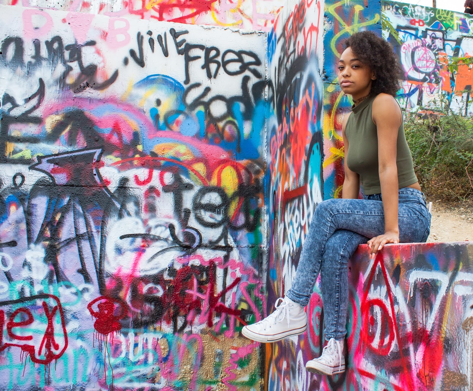
8. Mave Shaw
- http://cargocollective.com/maveshaw/photo
- I don't like anything about it
- I wish there was more structure to his website, he only has one tab for photos. I would like to see what else he does or the photo sets. There is no way to contact him, which isn't good.
- 3 drop downs
- 40 photos
9. Steve Mongare
- http://johnmongare.wixsite.com/sinziaphotography
- On the people tab, i like how the photos are large and spaced out. It makes its easier to look at them.He has a tab for booking online which is nice and looks pretty easy to navigate. On the blog tab, he has a slide show of the photos and he put a preview of them on the side.
- On his home page, 2 of the photos on display look good. But the last one (the girl with the car), part of the models body is covered by the menu. Some of the photos at the beginning of the blog tab have already been on the home page or the portrait page. I would have preferred if the repeat photos had been at the end of the blog photos and not at the beginning.
- 5 Drop downs
- 100+ photos
10. Tara Welch
- http://tarawelchphotography.com
- I really like that she has a link for reviews and a tab for her availability. At the bottom of the page, i like that she has her awards and whats she's been published in.
- I don't like the slide show at the top of each page, it's distracting to the photos I'm trying to look at. I don't like how her website is styled like a blog, i wish it had categories with photos instead of blog posts.
- 8 Drop downs
- 100 + photos
11. Mercedes Morgan
- http://mercedesmorgan.com
- I like the slide show at the beginning and what she's been published in at the home page. I like how the blog has a section for each of her categories instead of just having them all mixed together. I like how the prices are mentioned when you go to "wedding" and "portrait" tab.
- I don't like the website background, the black dots are slightly distracting. I wish she had a bio page instead of it being at the bottom of the home page.
- 5 Drop downs
- 100+ photos
12. Desiree Keelty
- http://desireekeeltyphotography.com
- I like that she has separate tabs for her reviews, awards, and bio. It makes it look more organized than if it was all on the home page. There is no blog layout which is nice, there are catigories/albums.
- I don't like the black background, to me the website looks slightly outdated. On the home page since the slide show images are so big, they look blurry and not very clear.
- 8 Drop downs
- 100 + photos